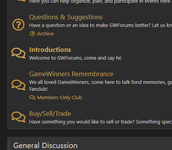
I'd posted this in just my Tavern thread, but everyone's welcome to check it out if they want.
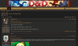
I've been playing with this new style some. I even made it public so you can use it if you so choose. Generally just trying to style it more like a D&D manual. I'm not in love with light themes, but it's fitting.
So far I have;
Made a new banner.

Started a whole stat-block thing. It's all manually entered for now, but who knows where it'll go.
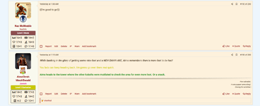
And I did some more styling on the dialog box I made to spice up my posts.
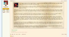
I've been playing with this new style some. I even made it public so you can use it if you so choose. Generally just trying to style it more like a D&D manual. I'm not in love with light themes, but it's fitting.
So far I have;
Made a new banner.

Started a whole stat-block thing. It's all manually entered for now, but who knows where it'll go.

And I did some more styling on the dialog box I made to spice up my posts.

My eyes would bleed.Is it possible to make that the default theme for just this forum?
It is, and I'd considered that, but forcing everyone to use a light theme wouldn't fly. If I can get a good-looking dark-mode version out of it, I could probably set it as default and use an option toggle, though.Is it possible to make that the default theme for just this forum?
You should see a doctorMy eyes would bleed.
Fair enough, now they're all squareLove it, and YES on the square avatars. I much prefer them over the circular ones.
You're amazing.Fair enough, now they're all square

Definitely notYou're amazing.
They're rounded.Is this why avatars are now squares?
Yes, that is my takeaway here.
I miss my circles. Squares are so rigid.
But yes, crystal made that site wide
Don't be a square.Is this why avatars are now squares?
Yes, that is my takeaway here.
I miss my circles. Squares are so rigid.
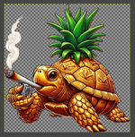
Noooo what have I doneI clearly need to figure out this transparent background avatar now which means I need to abandon the golden pineapple turtle.
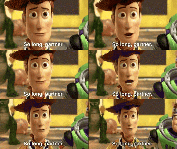
Beautiful!
Awwww
That's tight.
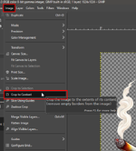
I don't know what you use for editing software, but I'd recommend GIMP if you don't have a proper one already. Most of the stuff Photoshop does, but open-source.
Specifically regarding taking something AI chucks out on a matte background and cleaning it up, you'll want to do a few more steps to get rid of that light stroke around the outer edge.
- Take your magic wand
-

- Click anywhere in the blank space to grab most of it.
-
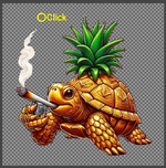
- Make sure you get all the little in-between areas too, generally Shift+Click.
-
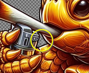
- Next click Select and then Grow....
-
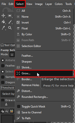
- Set it to 1 or 2 px and OK.
-
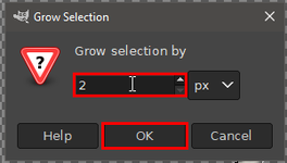
- It should now hug the outline of what you're wanting to keep better. Just hit Delete to remove it.
-
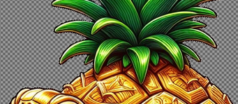
- Cleaner.
-

Thanks for the tip!
As a mobile user I don't really have fancy options so I used the Adobe Express online one.

fukken mobbies..
No TD, those are birds. Silly Canada.catfished.
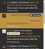
I take responsibility for the highlights there, I'll get those fixed ASAP!I like the Dark mode, but the yellow is painful in some places.
View attachment 14013View attachment 14014
For real. I've been trying to find where in the sheets it's got this linked to the linkColor, but hadn't yet. We had a similar problem on the other styles, just neither Crystal nor I can remember how it got fixed last time...I like the Dark mode, but the yellow is painful in some places.
View attachment 14013View attachment 14014
...No you're incompetent...
Now it's hard to read in the opposite way lolView attachment 14015
Found and fixed it.
@Crystal, app_alerts.less. I just stuck the background/text color override in here and it worked.
CSS:.alert { &.is-unread { .xf-contentHighlightBase(); background-color:#222; color:#dedede; } }
...Meaning? It shouldn't be black text on a black background.Now it's hard to read in the opposite way lol

I'm also trying to find what works for these blocks, so they're prone to changing. I opted to nix the regular avatar in favor of just the character one. The class +level is a link to the character sheet.
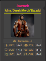
I did also work out how to actually use modifiers in the dice roller, so while you might still have to type in "3", it'd actually add it to the roll instead of just being in the comment.
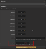
I'm guessing I could probably generate a dice roll from a link in one of the stat blocks... I just dunno if I can have it auto-set a modifier...

I did also work out how to actually use modifiers in the dice roller, so while you might still have to type in "3", it'd actually add it to the roll instead of just being in the comment.

I'm guessing I could probably generate a dice roll from a link in one of the stat blocks... I just dunno if I can have it auto-set a modifier...

Yeah. And on the forums, the bold yellow is just not visible for unread. Is a different color for unread possible?...Meaning? It shouldn't be black text on a black background.
Yeah, those were the two things that stood out. I can't really differentiate read vs. unread in both the forums themselves and in my alerts. Otherwise, I'm digging the dark mode with the gold. Very Bruins-yOh, you mean the unread threads, etc? That'd probably be a different setting, but valid. I can make more of a distinction there.
This is why Ben rules and Crystal drools, ladies and gents.View attachment 14015
Found and fixed it.
@Crystal, app_alerts.less. I just stuck the background/text color override in here and it worked.
CSS:.alert { &.is-unread { .xf-contentHighlightBase(); background-color:#222; color:#dedede; } }

You still rule imoThis is why Ben rules and Crystal drools, ladies and gents.

Still haven't found the separation between read and unread threads, but I did make the background on the notifications darker to make it more apparent.
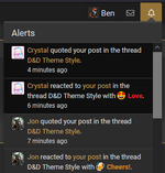
Don't worry, I'm still fucking lazy with my coding so didn't bother escaping for the picture not existing... Future Ben problems.
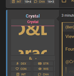

This is why Ben rules and Crystal drools, ladies and gents.

Don't worry, I'm still fucking lazy with my coding so didn't bother escaping for the picture not existing... Future Ben problems.

Last edited:
Funny... that's what I said... and precisely why I like it a lotI like the dark mode.
But it reminds me of the Boston Bruins.
But it's dark mode.
But it's BOSTON.
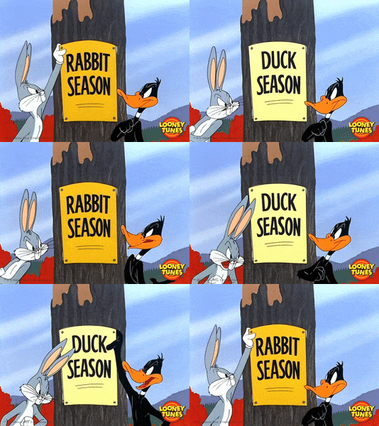

BEAR HUG!
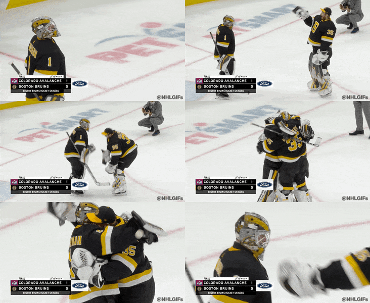
I won't lie, I am digging Boston's classic look. But still, divisional rival, lol.Funny... that's what I said... and precisely why I like it a lot
BEAR HUG!

Totally get it.I won't lie, I am digging Boston's classic look. But still, divisional rival, lol.
But even if I wasn't a Boston fan, the Bear Hug thing... I love it. Those two goalies THRIVE off each other and genuinely want the other to succeed so much that the Bear Hug has become so synonymous with them. I love it.
Best celebration in hockey, bar none.Totally get it.
But even if I wasn't a Boston fan, the Bear Hug thing... I love it. Those two goalies THRIVE off each other and genuinely want the other to succeed so much that the Bear Hug has become so synonymous with them. I love it.
Wives do it better

Oh? Guess I should try the Boston Bruins theme.I like the dark mode.
But it reminds me of the Boston Bruins.
But it's dark mode.
But it's BOSTON.

lol. Their wives did the goalie hug celebration.


