- Messages
- 6,411
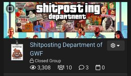
So I suppose I don't really expect this to get a lot of time invested to fix it, it's more my wanting to detail this inconsistent as fuck formatting. But the positioning and orientation of the group banners is all over the place between the desktop layout and mobile layout. It makes deciding how to align stuff to accommodate all layouts more challenging than my 2 brain-cells appreciate.
I've fiddled with stuff until it's at least acceptable, but I'd be remiss if I didn't probe whether there's an actual fix for it. I'm guessing there's probably some style-sheet that defines all of the banner sizes, alignments, etc. for different browsers, and that those may not be consistent...
Again, if this is a "deal with it" situation, I'm OK with that.
PC Group Screen.
Mobile Group Screen.
PC Group Banner.
Mobile group banner (portrait).
Mobile group banner (landscape).


